Saudi Central Bank — Public Portal Redesign
Redesigning a national financial platform to bring clarity to financial complexity.
Senior UI/UX Designer
Public website
8 weeks
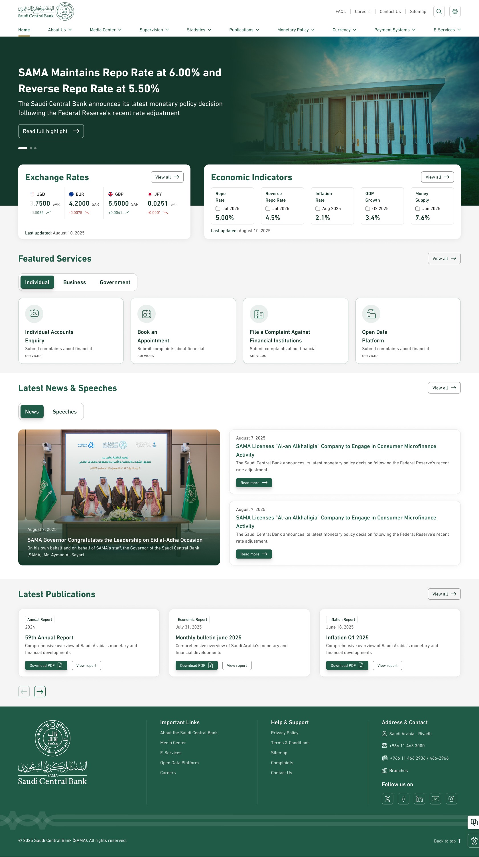
A full UX redesign of the Saudi Central Bank’s legacy public portal , transforming a fragmented, inaccessible experience into a clear, inclusive platform serving individuals, businesses, and government stakeholders, aligned with the new SAMA digital identity.
Designing for a national-scale platform
The Saudi Central Bank’s public website serves as a primary access point to critical financial information, regulations, reports, and public services. Over time, the platform evolved organically to support internal departments and regulatory outputs — rather than the needs of its users.
This was not a visual redesign challenge — it was a structural one.
As complexity increased, the experience became harder to navigate — especially for non-expert audiences seeking clear, trustworthy financial information.
PLATFORM CONTEXT
What made this platform uniquely complex.
National-scale public platform
High-stakes financial and regulatory content
Diverse audiences with distinct needs and expectations
key constraints
Formal institutional brand
Large volume of legacy content
Accessibility gaps in core user flows
Alignment with a newly introduced digital identity
section 01 - THE PROBLEM
A platform outgrown by its own complexity
Designed to reflect internal structures — not human goals.
How users were forced to navigate
Navigation mirrored internal departments
Users were required to understand SAMA’s internal organizational structure before finding information.
Content types were interwoven without intent
Reports, tools, services, and regulations appeared side-by-side.
Labels reflected policy language, not user language
Terms like “Monetary Operations” assumed insider knowledge.
Accessibility was inconsistent across primary paths
Contrast, hierarchy, and keyboard navigation varied by section.
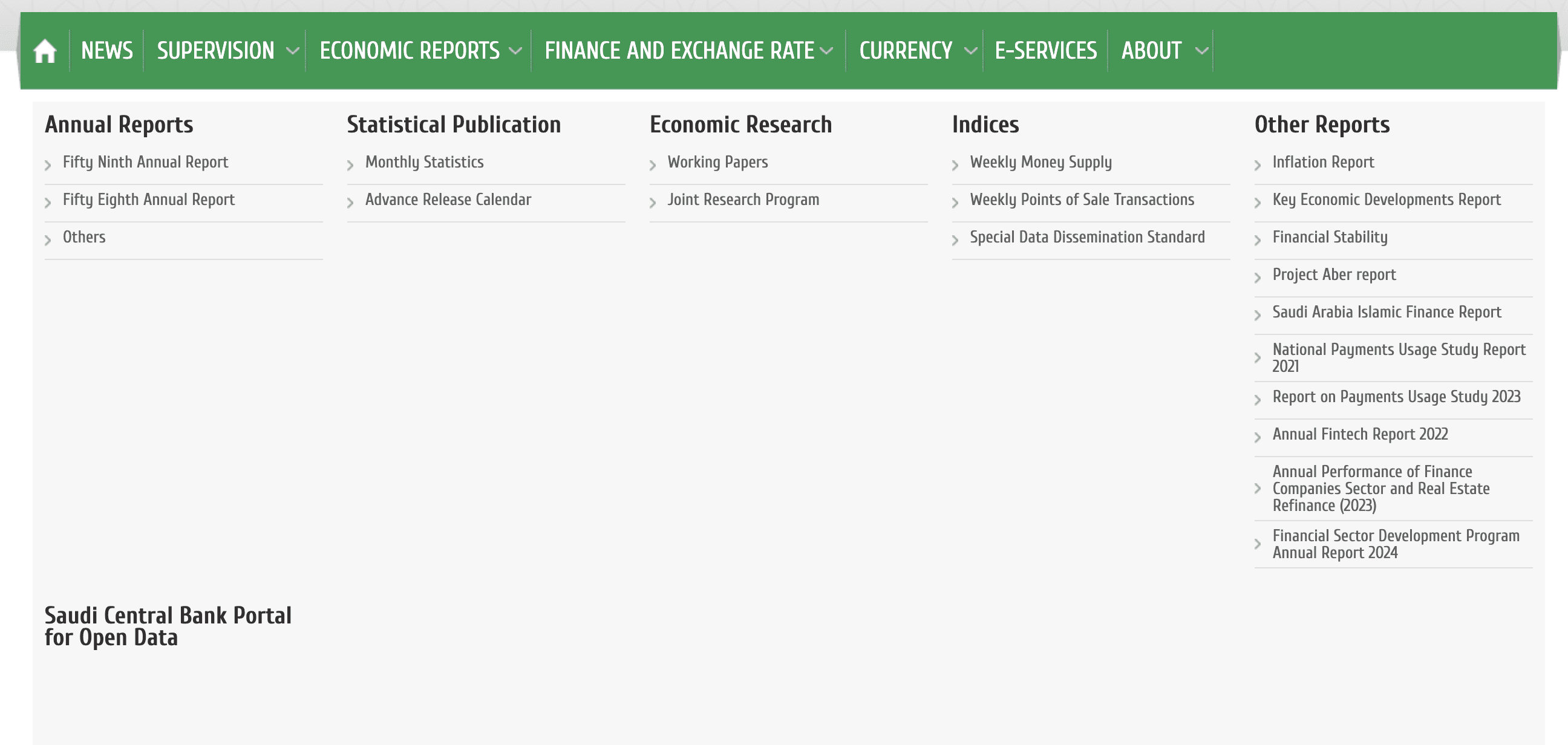
① Category overload
② Internal terminology
③ No user-goal grouping
Observed in the legacy navigation
Who this system failed
Individual
Needs a daily exchange rate — forced through policy-heavy navigation paths designed for regulators, not citizens.
Business
Searches for compliance guidance — buried under dense regulatory language.
Government
Looks for strategic datasets — scattered across disconnected sections.
Across usability walkthroughs, users required 3–4 attempts to locate basic financial data.
section 02 - Research & discovery
Understanding the system before redesigning the interface
Due to the institutional nature of the platform and regulatory constraints, discovery focused on understanding the system, stakeholders, and content structure before interface-level decisions were made.
Insights were derived from stakeholder discussions, policy documentation, competitive analysis, and hands-on analysis of the existing platform — allowing patterns to emerge without direct end-user interviews.
Rather than isolated usability findings, discovery revealed recurring structural patterns.
01
Navigation reflected governance, not user intent
Observed pattern
Navigation structures closely mirrored internal departments and content ownership rather than user goals.
Source of insight
Stakeholder discussions
BRD analysis
Competitive review
Content audit
→ Information architecture needed to shift from departmental groupings to intent-based pathways.
02
Language created friction before interaction began
Observed pattern
Many labels and category names relied on regulatory or policy-driven language that required prior financial or institutional knowledge.
Source of insight
Content review across top-level navigation
Section headers
Report categorization
03
Different audiences followed fundamentally different paths
Observed pattern
Individuals, businesses, and government entities sought different content types, yet were routed through the same navigation and hierarchy.
Source of insight
Persona framing during homepage design and validation through stakeholder walkthroughs.
→ The platform required distinct audience entry points and differentiated journeys rather than a single universal structure.
DISCOVERY INPUTS
What informed these insights
Due to the institutional and regulatory nature of the platform, discovery focused on stakeholder alignment, content structure, and real-world usage patterns rather than direct end-user interviews.
Stakeholder Discussions
Understanding policy ownership, governance constraints, and success criteria across departments.
Business Requirements Documentation (BRD)
Primary source for platform scope, regulatory obligations, and functional priorities.
Competitive & Comparative Review
Assessment of regional and international financial institutions to benchmark structure, clarity, and accessibility expectations.
Content & Navigation Audit
Hands-on analysis of top-level navigation, report structures, and content duplication across sections.
Persona framing during homepage design
Persona modeling conducted during homepage design to validate primary audience entry points and intent differences.
Next: structural decisions and system redesign.
With the problem clearly understood, the redesign focused on structural change before visual refinement.
section 03 - STRUCTURAL REDESIGN
From insights to structural decisions
DESIGN PRINCIPLES
These principles shaped the platform’s information architecture, navigation hierarchy, and audience entry points — before any interface design took place.
section 3.1 - STRUCTURAL DECISIONS
Information architecture & navigation redesign
With the core problems clearly identified, the redesign began at the structural level — redefining how information was organized, accessed, and navigated before any interface decisions were made.
What changed structurally
Instead of exposing all categories at once, navigation was redesigned to reveal complexity progressively — allowing users to move from high-level understanding to detailed content only when needed.
01
From departments → intent-based groupings
Top-level navigation was reorganized around user intent and content type, rather than internal departments and ownership.
02
From mixed content → clear content separation
Reports, tools, services, and regulatory content were separated into distinct paths, reducing cognitive load and improving scanability.
03
From deep hierarchies → shallow, predictable paths
Navigation depth was reduced to prioritize discoverability and limit decision fatigue in high-stakes journeys.
This restructuring established a clear mental model before visual design began — ensuring consistency across the entire platform.
section 3.2 - AUDIENCE STRUCTURE
Designing distinct entry points for distinct audiences
Discovery revealed that individuals, businesses, and government entities pursued fundamentally different goals — yet were routed through the same navigation structure.
Individual
Accesses public financial information and daily indicators.
Priority: Speed, clarity, plain language
Business
Seeks regulatory frameworks, compliance guidance, and official publications.
Priority: Accuracy, confidence, structured documentation
Government
Works with national datasets, policy materials, and strategic reports.
Priority: Depth, traceability, institutional alignment
This shift established a shared mental model before structural decisions were made.
SECTION 04 — OUTCOME & IMPACT
Designing a foundation for clarity at national scale
The redesign of the Saudi Central Bank’s public platform was not a visual refresh — it was a structural reset.
By addressing information architecture, navigation logic, and audience alignment first, the platform was reshaped into a system capable of delivering clarity, trust, and scalability across a national context.
What changed as a result of the redesign
Audience-based entry points replaced department-driven navigation
Content types were separated into clear, predictable pathways
Language and structure shifted toward user intent rather than policy terminology
Accessibility considerations were embedded at the structural level, not added later
MY ROLE
I led the UX strategy and structural redesign in close collaboration with stakeholders, aligning business requirements, regulatory constraints, and user needs into a coherent system before visual execution.
This project reinforced my belief that in complex institutional platforms, clarity is not a visual outcome — it is a structural responsibility.
